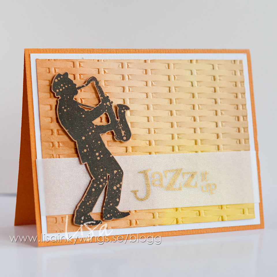
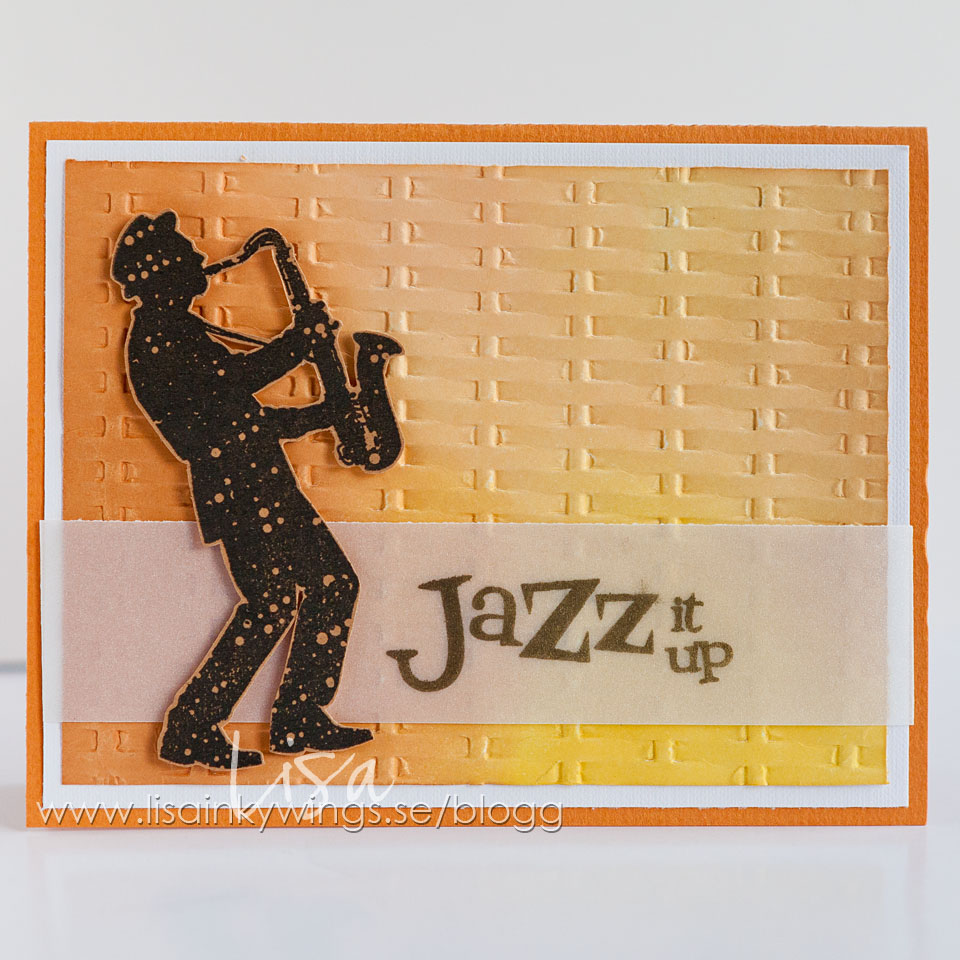
Jazz it up – for Visible Image
This is a fun technique to do, even if it shows up best in real life, not in photo.
I inked up a piece of paper with yellow and orange tones of distress ink. Swirl and blend them together a bit with blending tool (no inkpad direct on paper). Then I put some white mica-powder on top of it with a brush. I embossed the paper with an embossing folder so it got a 3D look. Then I used this piece on my card as a background to the lovely stamps from the Jazz it Up set.
This technique is called faux metallic and you’ll find a great video of it (where I’ve learned this) at Jennifer McGuire.
*************************
Ett kort idag till Visible Image där jag testat tekniken “faux metallic” som jag sett hos Jennifer McGuire. Har testat detta flera gånger nu och det blir riktigt läckert. Funkar med alla färger, blir precis lika fint! Stämplarna kommer från ett set som heter Jazz it Up och ett av olika “musik-kit”.


Stamps: Visible Image
Papers: Cardstock & Vellum paper
Medium: Distress inks, Mica powder
You will find all the amazing Visible Image Design Team inspiration over on the BLOG. Come and JOIN the Facebook Group where you can enter our NEW ‘Show & Tell Challenge‘ for your chance to WIN some awesome Visible Image stamps! And don’t forget to LIKE the Visible Image FACEBOOK PAGE too.
